In this tutorial, I'll show you how to make a Lord of the Rings-style text effect, as shown below....(I've also attached a pdf file of the tutorial to the bottom of this thread so that you can download and review at your leisure)

This tutorial, is written so that even GIMP-newb can accomplish it; however, you GIMP veterans will go through this quickly. If you would like to follow with me, you'll need to download the
Ringbearer font (Click Me!). This site also has a lot of other cool fonts, as well! I won't cover the specifics of installing fonts, but if you need help, just let me know. Just make sure you install the font prior to starting this tutorial so it will be available once you restart GIMP.
We'll be using some under-utilized GIMP gradient blend shapes to accomplish this task: specifically the Angled, Spherical, and Dimpled Shapes. Depending on the effect you're after, you can choose any of them. I'll show you screenshots of each style so that you can see the differences between them.
Step 1Open up GIMP and create a new document (File Menu > New or Ctrl+N). You can make it any color you wish, but I suggest something that will be different from the color of the text.....I'm using a white background.
Step 2Double-click on the Text tool button

and choose the Ringbearer font and set the font size according to your needs and make sure Anti-Aliasing is turned on as shown below. Also, make the text black in color.
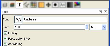
Next click on your GIMP window and add your text. If you need to re-position the text, click on the Move Tool (4-headed arrow)

and drag your text layer to the location of your choice.
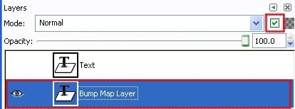
Your layers should now resemble this:
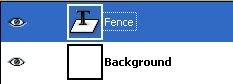
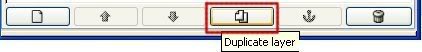
Notice that my text layer is 'blue'...this means the text layer is active, which is what we want. Now, click on the Duplicate Layer Button at the bottom of the Layer Dialog Window
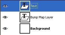
and your Layer Dialog should now resemble this (Notice I've changed the names of the layers for reference.)
 Step 3
Next, click on the Bump Map layer in the Layer Dialog Window to make it the active layer and then click on the 'Keep Transparency' checkbox.
What this will do is limit our effect to only those areas of the layer that are NOT transparent.
Step 4Now, we need to add a gradient to the Bump Map layer. First swap your colors so that you have the Foreground Color as white...

Next, double-click on the Gradient Tool Button
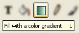
to open up the Gradient Tool Options Dialog.
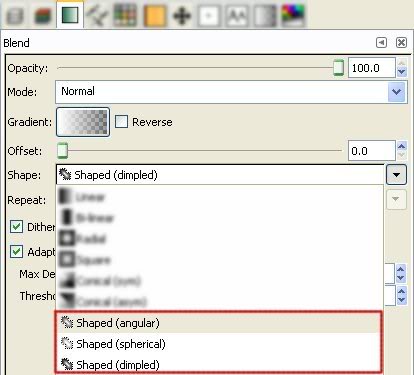
Here, you can pick one of the three gradient choices as shown in the dropdown: Angular, Spherical, or Dimpled. Each has its own way of working and I'll show you screenshots of what each one looks like. I personally think Dimpled looks best, but that's my opinion.
Click on the Gradient button as shown and choose FG to Transparent.
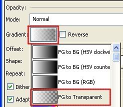
and here's a final shot of the Gradient dialog....
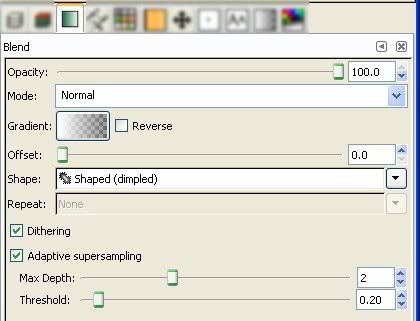
Now that your gradient options have been set, confirm that your Bump Map layer is active and the Keep Transparency option is checked, then click and drag anywhere on the GIMP image window to add a gradient to your text.
Don't worry about where you start/stop the drag because a neat feature of the gradient type is that it will fill every letter individually. Drag a little, drag a lot...it just doesn't matter.
Here are the results of the 3 Gradient Blend Types:
Angular Spherical
 Dimpled
Again, my favorite is Dimpled, but you choose which one you like best.
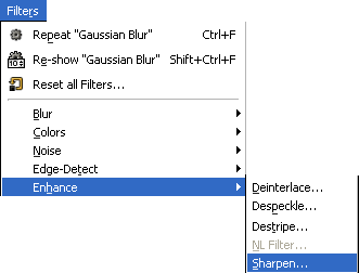
Step 5 (Optional)This step is optional, but I think it really adds to the effect. With the Bump Map layer still active, go to Filters Menu > Enhance > Sharpen
and set the parameters like so:
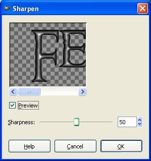
Then click OK to Sharpen the Bump Map layer. Do this one more time (Ctrl +F).
Two things: What does this do? Why not set the Sharpen Value to 100 and run just once?
The purpose of this is to make the chisel effect very sharp. Using the Sharpen Filter will enhance the edges a bit to give it a more pronounced result. The reason we don't set it to 100 and run just once is that it will look very, very bad. But, everything here is open to experimentation, which I strongly urge you to do.
Step 6Let's change the color of the text layer to a gold color. Make the Text Layer active by clicking on it in the Layer Dialog window....
Then, click on the Foreground Color Swatch
And enter a value similar to mine (I used d5ce5f)
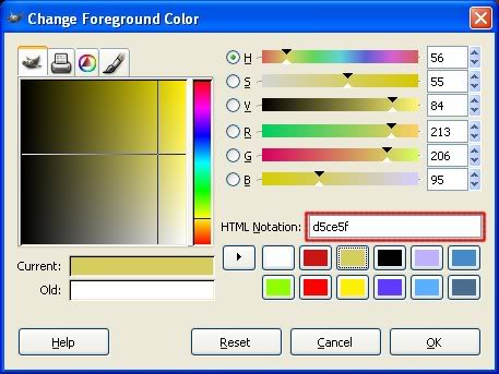
And choose OK to accept the change and close out the color change dialog window.
Now, click and hold the gold color swatch and drag it over the main window like shown....
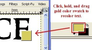
Let go of the mouse button and your text layer has been changed! Pretty neat, eh?
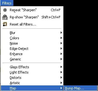
This will only work if your Text Layer is Still a Text Layer. What I mean by that is if you resized your layer or did anything else to the Text Layer, it's no longer an editable text layer. If it's no longer an editable text layer, make sure you choose the Keep Transparent checkbox for the Text Layer (I showed you how to do this for the Bump Map layer in Step 3 above) and then the above drag/drop color change concept will work fine.Step 7With your text layer still active, go to Filters Menu > Map > Bump Map
and select the Bump Map Layer in the highlighted section shown below.
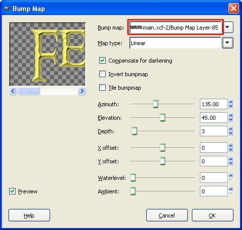
Now, experiment with the various settings (I used the ones in the screenshot above) and when you're satisfied with what you see in the Preview Window, click the OK button to make the changes.
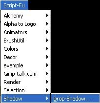
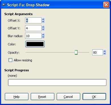
Step 8Now, let's add a drop shadow. With the text layer still active, go to Script-Fu menu > Shadow > Drop Shadow
and set your settings...this is what I used....again, experiment!
 Step 9
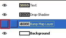
Lastly, delete or turn off the Bump Map layer in the Layer Dialog Window. To delete it, click on the Delete Layer Button at the bottom of the Layer Dialog Window

(Or go to Layer Menu > Delete Layer).
To turn it off, click on the highlighted button shown below to turn the 'Eye' off.
It doesn't matter which option you choose, you just don't want any of that layer showing through.
Here are what the various blend shapes look like after the Bump Map step....
Angular Spherical
 Dimpled
Now, go to File Save (Ctrl+S) or Save As (Shift+Ctrl+S) and save your wonderful creation. I suggest you save it as a png or jpg.
Well, that concludes this tutorial. Hope you learned a few new tricks! Make sure you show me your results.
Art
You may also want to check out this script-fu that I've created LOTR Script-Fu


