Hello class today we are gonna have a little discussion about Depth and Contrast.
For this tutorial you are gonna have to have a pretty good knowledge of layers and the layers>color tool menu.
You will also need some good music to jam out to while working!
So you may ask yourself what do you mean by depth and contrasting.
The easiest answer i have for you is
"Two ways to make your sigs or other digital art work appear less flat or two dimensional. A technique to add more texture, or give a more three dimensional look and feel."
Once you master the art of depth and contrasting you will see your sig come to life!
For this we are not going to be creating a sig but instead I will just be showing you how to create a depth and or contrast layer to add to your own project.
First thing open up your sig projects.
For this I am gonna use a sig that was made by damF. Mnay thanks go out to him for letting me use it!
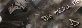
Most of you would consider this sig finished besides doing some detailing work and maybe adding a border.
But not I to me it looks really flat and the coloring is bland. No pop to it!
-----------------------------------------------------------------------------------------
So lets get to work pimping it out!
First we are going to make a depth layer.
Steps:
Duplacting your almost completed sig.
1-a:
Working w/ a flattened image![/u]
If you are working on a file you already flattened and saved as say a png file than this isn't a problem. Just duplacate the background layer.
Rename the duplacated layer to Depth Layer.
Example: DC 01a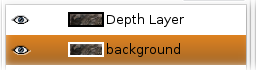
1-b:
Working with a xcf file or unflattened image!If you still have the xcf file and it hasn't been flattened (you still have all your layers) follow these steps!
Make sure the layers are visable and click Edit>Copy Visibile.
Than create a new layer.
Click Edit>Paste Into than anchor the layer
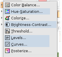
Now we have the Depth layer set up time to play with the settings.
Take a moment to get fimilar with the Layer>Colors Menu.
The main tools in here we are gonna use are
- Hue/Saturation
- Contrasting/Brightness
- Levels
- Curves
Example DC 02
OK from here on i am just going show you the settings for each category
2:Hue-Saturation
Hue: 0
Lightness: -30
Saturation: 15
3:Brightness -Contrasting
Brightness: 30
Contrasting: 15
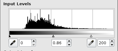
4:Levels ? Ok this one just takes some time to play with to get right but here is a screenshot of the settings i used!
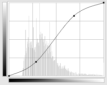
5:Curves once again i will just use a screen shot try to use a setting close to it
6: Click Filters>Enhance>Unsharp mask. Use the default settings.
Default Should be
Radious: 5.0
Amount: 0.5
Threshold: 0
9: Set the layer mode to softlight and opacity to 50%
Now you are done with the Depth Layer.
----------------------------------------------------------------------------------------
Now we are going to create a Contrast Layer
Refer to Step 1a or 1b of this tutorial to create another duplacate of your sig and name the duplacate layer Contrast Layer!
Steps
All of these steps are done to the contrast layer.
10: Click Layer>Colors>Desaturate
11: Click Layers> Colors>Invert
12: Click Filters> Enhance>Unsharpen Mask. Use the default settings
13: Click Filters>Blur>Gausin Blur. Give it a strength of 4 to 6
14: Set the layer mode to softlight and opacity to 45 to 50%
There you have it a pimped out sig using depth and contrasting. The colors are more vivid and alot more simple detail has been added in. Now the sig has more pop to it and catches the eye.
Before Pimping
After the Pimping
Hope this helps some of you !


